Monday 31 July 2017

NEW KIT - MOMENT BY MOMENT by Liane Van Harn

My latest kit is now availble @ R255.00 excl postage.

This layout is a fun layout using the amazing new Celebr8 Daydreams patterned paper and includes
Celebr8 famous Lanki chipboard set as well as a full packet of their brand new flowers.

There is also enough left over to create cards so nothing goes to waste.

To order your kit email lianevharn@gmail.com or whatsapp me on 061 092 6281


Wednesday 19 April 2017

SILHOUETTE DESIGNER EDITION

There has been a lot of new Silhouette users lately, and a lot of you have been wanting to upgrade to the Designer Edition but with the rand/dollar exchange it works out to be around R600.00 which is pretty steep .... so today I am going to share a link with you on how to get your upgrade at about HALF THE PRICE...


Now I know what you are thinking...will this work in South Africa, and is it legit?

Well the answer is yes to both.  I teach a monthly mini class with a few ladies on the second Thursday of every month and last week we played with converting images to SVG file but unfortunately if you have the free software that comes with your machine you can't open SVG files and you would need to upgrade.  So we went looking and found this amazing site by Swing Design and they have this sale on.  It was easy and fast with an instant code being emailed to you.  It was EASY.

There are loads of reasons why you would WANT to upgrade to the Designer Edition so don't delay upgrade today.

Just a little bit of info on SVG Files...they are amazing, all your tracing has been done for you so if you find FREE SVG files the trace lines are already there, you can just go ahead and cut.

Hope you have loads of fun looking for FREE SVG FILES.

Till next week
xoxo
Liane

Wednesday 12 April 2017

COMBINING 2 IMAGES TO CREATE A CUTTING FILE

I was totally inspired by Glenda Viljoen new Penelope Dee "Go see do" range of paper and embellishments and then I think most of you who know me well, know I just love love love doing Travel layouts and just love love love Tim Holtz Globe and now Glenda has done one using the Map of Africa, so I thought, wait a minute, what if I want my globe bigger?  What if I can create my own using different images will it work?

Well the answer is below...you tell me!

Step 1:

I found a globe on the Internet and traced it using the "Trace" function.  If you haven't traced yet and need a recap, please go look at my previous lesson on Trace and cut for beginners


This is what my trace looked like after I separated the original image from the trace.


Step 2:

Now I traced the Map of Africa in a circle using the trace function once again.


Step 3:

Using the "Scale" icon size both the Globe and the Map of Africa so that they are the same same.  In this instance, I clicked on the globe and saw the height and width, made a note of it and then I clicked on the Map of Africa and sized it the same as the Globe.  Remember you might need to "Uncheck" the "Lock Aspect" otherwise you might not get them to be exactly the same size.


Step 4:

Now this step isn't necessary, but for me it just makes it easier to see the different colours while working on the next few steps, so using the "Paint bucket" i.e. "Open the fill colour window", I coloured the Map of Africa in red and the globe in Black.


Step 5:

Now click on the "Align" window and highlight both the Map of Africa and the Globe and click on "Center".  This will now align both the Globe and the Map directly on top of each other.


Step 6:

This is now a very important step, if you don't do this it will not work properly.

Click on the Globe ONLY and then right click > Bring to Front. 

What this does is make sure that the Globe is sitting on top of the Map of Africa.  You can also see how this helps with the colour as if the Globe was at the back you wouldn't see all the Globe lines.

The image below is CORRECT


The image below is INCORRECT


Step 7:

Now click on the "Modify" window.  Highlight both layers i.e: Globe and the Map of Africa and then click on "Subtract All".  It will look like nothing has happened, but before you panic, click on the top "Globe" layer and drag it off as per the 2nd picture below


Step 8:

After dragging off the Globe you will be left with the Map of Africa and the grid lines. 

We are almost done!


Step 9:

You now need to create an outside circle of the Map of Africa to join the cut file together, and to do this you will use the "Offset" icon.

Click on the "Globe" then click on the "Offset" icon as highlighted in blue below.  You will see the "Offset" window open up on the right hand side and then if you click "Offset" you will see an outer circle appear, now before you click anywhere you can adjust the distance by clicking on the slider of the up and down arrows which will either make the offset you have created bigger or smaller, when you happy with the distance, click "Apply"

Now right click > release compound path

you will notice every little square and circle has a block around it.  If you click in the free area and then click on the outer circle you can now move this circle to around the Map of Africa globe you have created.  Centre the Map of Africa inside the outer circle and the 

right click > make a compound path


Step 10:

Now click on the Eraser tool on the left hand side and then clean up any little pieces that are floating as they will just waist your time when you cut.

When I clean up, I enlarge and delete as you can see on the left hand side of the globe, where I am deleting those little lines that are pointless.


Step 11:

After you have used the Eraser tool, you will once again need to select everything and the 

right click > make a compound path

this is because the minute you erase an area from a joined cut file, the software automatically breaks up all the individual cut files so it can delete it.


Step 12:

You are now ready to cut your file.


Cut file, ready to be coloured and used.


Hope you enjoy being creative and would love to hear what you think about this weeks tutorial.

Until next week
xoxo
Liane

Wednesday 5 April 2017

PAPER PIECING USING YOUR SILHOUETTE MACHINE

Another favorite using my Silhouette Machine is how to use it to do paper piecing...well with Easter around the corner I thought I would share how to make a cute Easter Bunny for your Scrapbooking layouts.  Remember this can be done with ANYTHING as long as you stick to the basics of tracing, breaking apart and cutting.

Let's get started:-

Step 1:

Find a picture on the Internet that you would like to use.  I generally would look for FREE download patterns that way I am not coping something that I shouldn't.

Save the image to your computer, then open it up in your Silhouette programme.

Step 2:

Now you have your image open, click on the "Trace" button which you will fine along the top.  The button has a yellow square with a blue butterfly inside it.  Now trace your image.  If you are new to tracing please see my tutorial on tracing by clicking on this link.  Click her to learn how to trace

This tracing was ever so slightly different as I did the tracing in 2 steps due to the the pink details in the picture.  So my first trace I did I concentrated on the outside lines (all the black detail) as below.

Step 3:

As you can see below I now have the black details of the image traced, but now I have started tracing again, this time concentrating on the "Pink details" of the bunny.  Once you are happy with the tracing click trace again.

 Step 4:

Now I sized the 2 different traces so I could have them both on the same screen shot for this tutorial but it is VERY IMPORTANT that if you want to resize the images at this stage that you have both selected and size together otherwise they won't fit.

In order to select the images and size, click with your mouse on the left button and while holding the left button down drag your mouse until everything you want to resize is selected, then release your left button and then from one of the 4 corners drag the image smaller but moving the square in once you are satisfied with the size release.

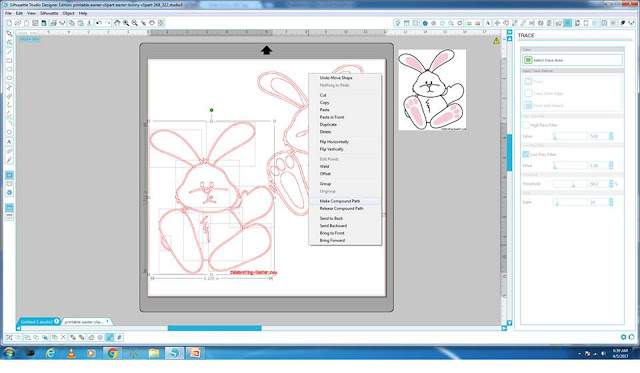
Now we have the bunny sized lets start by breaking the bunny apart.  In order to do this you need to select the one bunny first and then "Right click" > "Release compound path".

You will notice a whole lot of individual little squares open up around the bunny so if you click into the FREE area now away from the bunny then you can click on the individual lines of the bunny to start manipulating what you want.

In this instance we want to select the details of the face so that they are all one, so by click on the one eye, then the next eye and then the mouth.  (Don't forget when selecting multiple lines that you want to keep together you need to hold your "Shift" button down then click on the next item)  Once you have selected all the details of the face (NOT THE HEART NOSE YET) you will "Right click" > "Make a compound path".

Now repeat this on the tummy area by selecting the zig zag on the tummy and the tummy itself, then "Right click" > "Make a compound path".

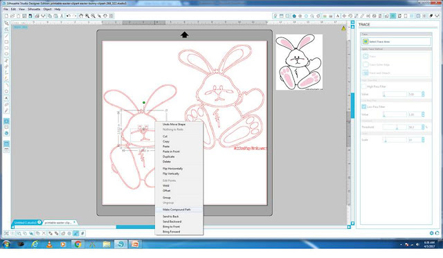
Now I selected all the "White" areas of the bunny.  I use the coloured picture as a guide.  So in this instance the "Inside ears" > "Face" > "Arm" > etc once you have selected all the "White" areas right click and "Make a compound path"  (Just remember once again when selecting various areas in order to join them together you need to hold your "Shift button down".

At this stage a few of you will be saying but it's not selecting the area.  Just make sure that when you trying to select an area that you click ON THE LINE, it doesn't work if you click in the centre of the area.

In this image I am selecting the face features

In this image I am selecting all the white area of the bunny
 Step 5:

Now before I start working on the pink areas I need to colour the area's I have just worked on.  And to do this I click on the "Paint bucket" along the top.  If you hold your mouse over the paint bucket is says "Open the fill colour window".  I then clicked on the "outer area of the bunny and then clicked on "Black", then I clicked on the area that should be white and then clicked "White".  Now you should have an image like mine below.

JUST REMEMBER THAT COLOURING THE IMAGE IS JUST A VISUAL PICTURE OF WHAT THE BUNNY WILL LOOK LIKE ONCE YOU CUT ALL THE DIFFERENT COLOURS OUT.
 Step 6:

Now lets work on the other bunny that you traced where you concentrated on the "Pink" areas.  Once again, click on the bunny "Right click" > "Release compound path".

Now you want to select all the pink areas, but in this instance you will see the left ears, pink area is joined to the white area and we need to break them apart.  There are a few way in which to do this but in this instance the best for me was to "Double click" on the ear and get the "Edit points" - lots of black dots.  Now I clicked on the dot at the bottom right of the pink area and then clicked on "Delete point", I repeated deleting the points until all I had left was the pink area I wanted.  (You will see the pink smudges under the eyes, I left as I will just draw that in later using the drawing tool)

Once I have the pink area I wanted I clicked on all the pink areas keeping them in position then I "Right clicked" > "Make a compound path".  Now you can either colour the areas pink now or move it first then colour it's up to you.
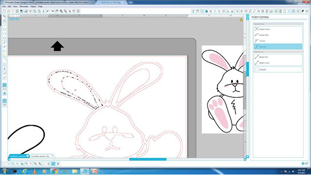


Deleting the Edit points to break the pink area away from the white area
 Step 7:

In this instance I moved it first but when I did I noticed that my pink area was going behind the colour bunny that I worked on first so in order to bring it to the front you need to "Right click" > "Bring to front"

Then drag the feet and ears over the 1st coloured bunny until you happy with the placement.

 Step 8:

Now colour the pink area's using the paint bucket "Fill" window again, this time colouring it pink.

Then you can delete all the area's of the bunny you don't want so you just left with the coloured bunny and the original picture.

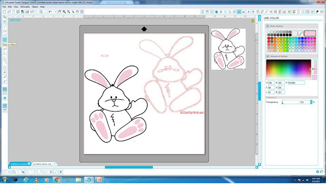
Now in order to make the smudges under the bunnies eyes, I drew 2 ovals using the "Draw an Ellipse" tool on the left hand side.  Once I had an oval I coloured it pink and moved it into position.

Step 9:

Your completed bunny ready to start cutting.

Just remember you will need, black, white and pink cardstock to make this bunny.
 Step 10:

I placed all the pink areas I need to cut on the cutting surface and moved the black and white areas off into the grey area (Anything in the grey area won't cut).  I then put the pink cardstock onto my cutting mat and cut the pink areas.  When that was cut I then put white cardstock onto the cutting mat and cut the white area, followed by the black.

Now you can ink and glue the various area's together to make a cute paper piecing bunny.

 I hope you enjoyed this tutorial, and I would love to hear from you or see what you create.  I have also included the "Free cut file", simply click on the link below to download the file.


xoxo
Liane

Wednesday 29 March 2017

HELP MY BLADE IS TEARING MY PAPER!

HELP MY BLADE IS TEARING MY PAPER!

WHAT NOW?  HOW DO I FIX IT?

I have been asked this a few times this week by different people.  There is nothing more frustrating than having to cut invites or anything for that matter and your paper is ripping and chewing your paper.

Well today I will share a tip with you that I learnt and no it's not fool proof but for me and majority of the ladies having this problem it has worked for.

I got the following message yesterday on Facebook and a similar message posted to another group and my personal page earlier in the week:-

"Hi this is a question for Liane Van Harn please help...my Silhouette is chewing my paper. Placed in a new blade, used a fine brush to brush away any maybe little paper snips, mat is not too sticky. I am using washi tape to hold edges in place....grrrr...blade setting is correct according to Silhouette cardstock. I am double cutting....want to cry."


Does this sound familiar?  To a lot of us I know we have had this but don't fear I will share a trick that I find works 99% of the time.

It's ALL in the settings!

First of all, at the tip of your cutting blade, there is a white cap.  Remove the cap by turning it anti-clockwise and then give it a good blow or use a tweezer to get the paper out.  A lot of the time we will have fibre or bits of paper that bung up the blade, stopping the blade from rotating like it should and this will without a doubt tear your paper even if you stick to the setting below.


When cutting CARDSTOCK I generally ALWAYS use the following setting, my reason for that is that most of the time I am cutting textured cardstock and the cardstock is made up of fibers so when the blade cuts it is having to go through the layers that make up the paper.

Paper: Cardstock
Blade: 3
Speed: 10
Thickness: 33
Double cut: yes
Line segment overcut: on
Start ext: 0.1
End ext: 0.1

(see image below, as I would cut something like the rose card below)


Now I know what you thinking!

Speed: 10 are you crazy?  No actually my thoughts on this is when cutting a detailed image and you slow your speed down the blade is dragging and if there is a nip it will drag the nip into a big tear.

Thickness: 10 - This is not cast in stone, it depends on what cardstock you are using but the textured cardstock most of us get in our Scrapbook shops in South Africa I find this the best.  If you using a smooth cardstock you can lower this

Double cut: yes - Once again I use this for the textured cardstock so that if the blade missed a double layer of fiber on the first round it will get in on the second time round.  You don't have to double cut for a smooth cardstock that you would generally use if you making invites.  But then that depends totally on the thickness

Line segment overcut: On - This is an amazing feature that not a lot of people use.  What this feature does is starts cutting at 0.1 mm before the actual cut line and ends at 0.1 mm after the cut line.  So this STOPS all those nasty corners from being ripped as its not turning on the point.  
In other words if you cutting a triangle, you will get a pointed triangle, not a rounded tip triangle.

I hope this makes sense and that next time you will try this, it's worked for me and it's worked for the two ladies this week that were ready to throw there machines or cry.

Till next time
Liane 
xoxo


Wednesday 22 March 2017

10 getting started tips for Sihouette Cameo Beginners

SILHOUETTE CAMEO BEGINNERS: 10 TIPS 

Today we are focusing on all the beginners that purchased machines RECENTLY and some of which are to scared to take the machine out the box....we have Melisa from Silhouette school helping you out...


SILHOUETTE CAMEO BEGINNERS: 10 TIPS FOR GETTING STARTED WITH YOUR FIRST CUT

If you want to avoid being one of those Silhouette CAMEO beginners who leaves their Silhouette 
cutting machine in the box for days or weeks or months or years (yes, years!) because they don't know 
where to start....allow me!


http://www.silhouetteschoolblog.com/2016/12/silhouette-cameo-beginners-getting-started.htmlClick here to see the full post

Till next week

Liane 
xxx

Wednesday 15 March 2017

USING THE REPLICATE TOOL TO MAKE FLOWERS (Designer Edition required)

Today, we have a some more designing techniques for you to play with using your Silhoutte software.

Firstly, I need to give the credit of the tutorial idea regarding moving the centre of rotation point to one of my amazing students that attended one of my many classes.  Mariaan, recently purchased a Silhoutte machine and received a free class with me as part of her bundle, but I must say Mariaan, was my most advanced, beginners ever!  So this tutorial is thanks to Mariaan finding out about moving the "Centre of rotation"...Thank you for sharing this with me Mariaan.

So now let the fun begin...

Firstly in order to create the flower petals like this you would need the upgraded version of the Silhouette software called "Designer Edition" as the Centre of rotation is only visable on that edition and not the standard software that you get free with your machine.

CLICK ON THE PICTURES BELOW TO MAKE THEM BIGGER


To draw the petal shape, you click on the the drawing icon circles in red on the left hand side that is in a figure of "8" shape. 


Some might say, but if I select my petal I don't have the centre of rotation point visable & how do I fix it?  This is a quick fix.

When you have your software program open in front of you in the bottom right hand corner you will see a gear.  If you click on the gear a "PREFERENCE" window opens up. 

Now Click on "DEFAULTS" > tick "SHOW CENTRE OF ROTATION" > apply

Now you should see the circle in the middle, being the centre of rotation.


In this example, I rotated 3 copies, your can rotate five copies to get a totally different flower.


Once you have cut the flowers...decorate as desired.

I played with the Tim Holtz Distress Oxide inks to colour my petals


Till next week.

xoxo
Liane